That annoying meme
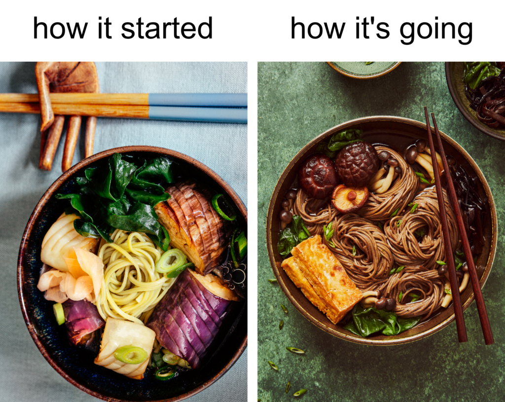
I got so fed up with that annoying “How it started vs. How it’s going” meme on Instagram that I decided to make my own. There were some funny ones out there, but also plenty of pretentious displays of unrealistic success, too. Like, last year I did this, and now I’m on the cover of a magazine! Below is mine, 2017 vs. 2023. Sigh.

Again, I wondered: how do they do it? Is it really possible to progress this fast? And all that without any formal training? Really, you picked up a camera only last Christmas? I just can’t believe it, but oh yeah, I believe it. So what do I do? I start comparing myself to others, only seeing my shortcomings, and beating myself up because I don’t progress fast enough. Do not go there, my friend! This is the path to the Dark Side. (By the way, I love memes.)
An even better idea
I got a better idea. Why not compare yourself to yourself? I was recently digging in my Lightroom and very quickly went down the rabbit hole. You won’t believe the pics I found. Like the one on the top of this post, and worse too. I thought to myself: Well, look at that! Mama loves you even though you’re an ugly child. (This reminds me to warn you; don’t kill your darlings! You’d be amazed at what you can achieve in a year or two when you advance in your editing skills.)
And then suddenly I got an even better idea. Why don’t I try to reshoot those bad ones from years ago, and then we can compare?
This is how the idea of this blog came to life.
My failures are my best teachers.
Reshoot
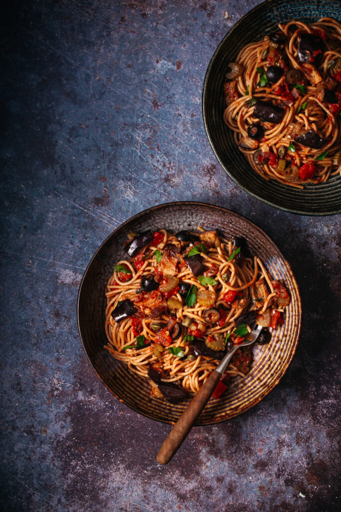
Let’s start with this shot of Spaghetti Caponata. I saw it in one of the food magazines, and it looked wonderful and super delicious, so I decided to shoot it, just like on the cover of a magazine.
Well, nope.

Oookay… Hmmm, looks nothing like in the magazine. The food styling is awful, clueless composition, and the editing is a disaster. It’s also underexposed. Like many beginners, I too made the mistake of taking underexposed pictures for dark and moody style. I like the props though, the surface, and the minimal style. Let’s see if I can make it better now.

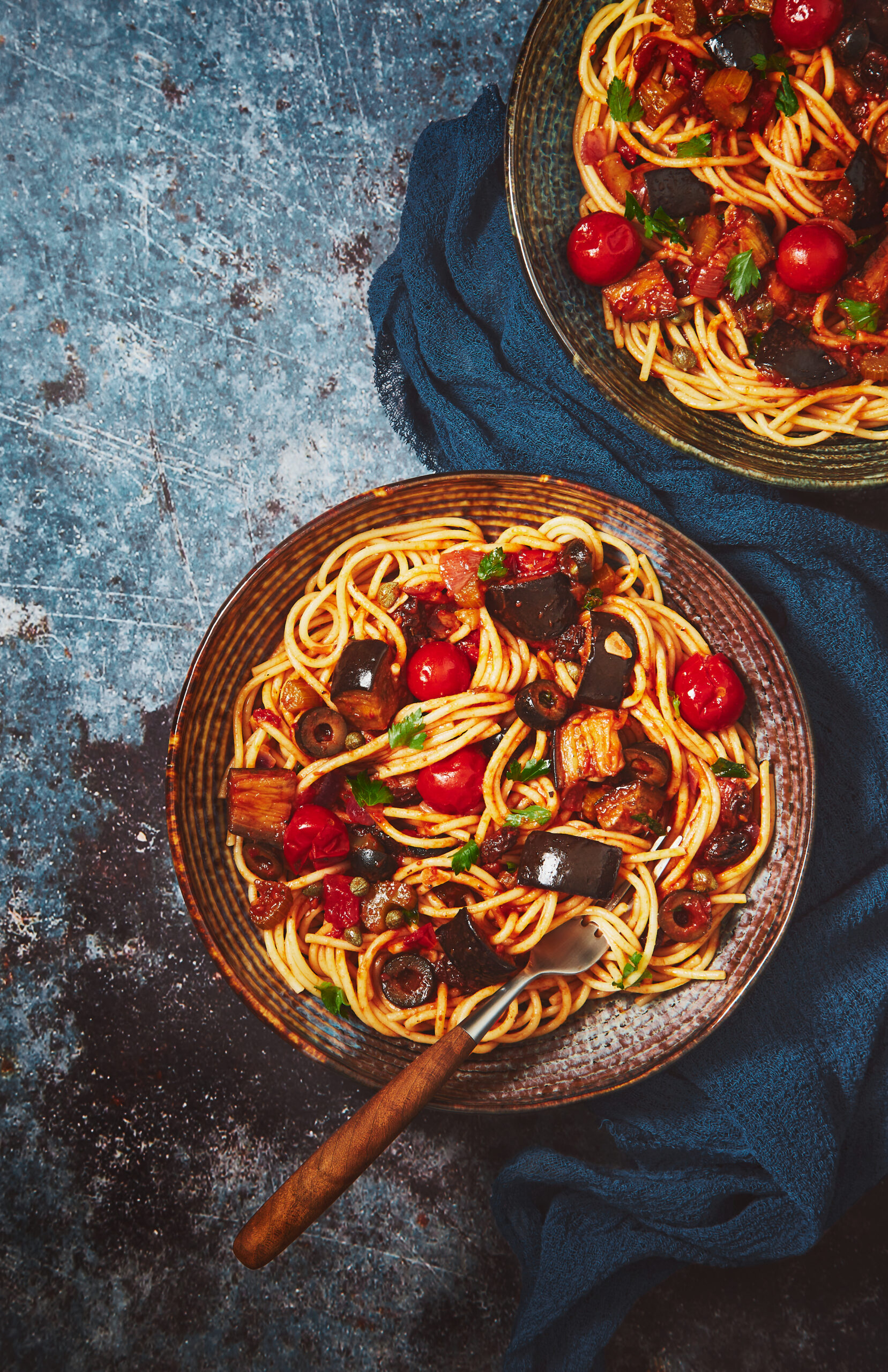
I think it’s much better now. Not the cover of a magazine thing, but it’s better than before. By simply adding a fabric, the story of the picture becomes more interesting. The food styling could be better I guess. Pastas and noodles aren’t easy to style but like with everything else, it’s a matter of practice. Each time you do it, will be better.
Careful editing is essential when it comes to food photography. I always try to keep the colors real, being cautious to not oversaturate, although I did a lot of color correction in Capture One on this picture to make it look more appetizing. Those cherry tomatoes for example were so juicy that they came out nuclear in the picture. I kept desaturating them till there was almost nothing left. Reds and oranges are very challenging to edit, so my advice to you beginning photographers: Do not oversaturate your pictures in post-production. Keep the saturation at 0 and work the colors separately, then see where you go from that.


This is the before/after. What do you think? Let me know in the comments!
See you the next time!
Bonus!
You can read about the history of the “How it started vs. How it’s going” meme here.

I love the real behind the scenes view! I don’t do food photography, but I really recognized a lot of the issues that no one ever talks about! I think your blog is an inspiration to all of us who want to create. Keep up the good work and never give up. Looking forward to reading more!
Dear Milena, thank you so much! Your comment means a lot to me.